Wednesday, December 2, 2009

The “2009 was– pretty lame, but there was some pretty awesome music” list of 20 albums from 2009


Click the image to see my choices for my top 20 records of 2009!
I spent more time than I should of on this so feel free to look
as long as you like ok guys!

Tuesday, December 1, 2009

Akzidenz! Holidaze!


Here is a little postcard I designed for the holidays.
I mixed up the "Merry Christmas" and "Happy Holidays"
solely because I, and I alone, think it sounds funny.

The typeface is Akzidenz Grotesk Medium.

Happy Christmas! Merry Holidays!


Head-spinning: Katatonia, The Mountain Goats,
Espers, Red Pepper Hummus, and clarity

Thursday, November 12, 2009

Catch for Me the Foxes


This poster above is my favorite of the "film series"
that we worked on in the earlier portion of the
semester. For the film, "The Royal Tenenbaums"
I immediately connected with this idea of the
characters being these sly and secretive characters,
creeping around causing mischief for themselves
and others. Naturally the fox is immediately tied
(albeit quite unfairly) to this type of behavior.
I then decided to place them in a rather ornate and
flamboyant upper class room that might exist in
the world of Wes Anderson's film. The fact that
the found image of the room contains the eiffle
tower was a nice touch, especially if you see
the rather distant fox to be Margot.

As for the typography and layout, I wanted to express
a feeling of "functional dysfunction", which was
basically the theme that drove my film festival. I chose
the akward placement of the image in the corner to
create a slight tension, and then placed the type along
a grid, but in a somewhat disjointed manner,
placeing the description text over the image which
should never really be done without a reason...especially
with body copy.

The final conceptual aspect was that of the color choice.
I chose the red to tie into the color I immediately thought
of when I pictured the film itself. I then chose the type
colors to completely combat the background color, making
it nearly painful to look at. I got this idea from one of my
absolute favorite firms, Experimental Jetset's poster
series for De Theatercompagnie. The results of which, are
humourously blinding even on screen.

Ill post the remainder of the project soon.


Music Carousel: The Avett Brothers-"I and Love and You",
Katatonia-"Night is the New Day", breathing, Studio Culture
by Adrian Shaughnessy, White Peach Cranberry juice, and
Gossip Girl (Seriously.)

Sunday, October 4, 2009

Master of None


Above are a few of my favorite sketches for the second
run of poster sketches. The last one is moving in a
direction I want to get behind, although a good deal
of refinement and "conceptual" tweaks need to be made.
Onward and upward.


Orbiting: Julian Casablancas-"11th dimension",
Brand New-"Noro", New Converge and Broadcast,
and anatomy of a typeface.

Tuesday, September 29, 2009

The Constant Image


If you look to your left, you will notice a new addition to the section regarding
my other locations on the interwebs called The Constant Image. What I
hope this to be, is a collection of random images I make in the vein of other
"image a day" exercises that designers are known to partake in. I will set
it all up in due time, but for now it has one sketchy image in response to a
black metal album I very much enjoy by Deathspell Omega.

Let's see how this goes.

Monday, September 28, 2009

2:30 Am Design Heart Attack


Well I'll be damned. I have seen Mark Weaver's stuff
before courtesy the perma-excited Robyn Baker and
always found myself enjoying his work. The above
images take that enjoyment all the way to home base.
His work is simply stunning. It has a weird Text-book-
by-way-of-retro-modernist-sepia vibe that I'm really
into. Just check it out NOW.

That state poster blows my heart out of it's steel cage
and explodes in my face. real talk.

Orbiting: Katatonia-"Forsaker", Broadcast-"Noise Made
by People", saltine crackers, drawing letters, Deathspell
Omega, and Fuji Apple Pear Lifewater.

Thursday, September 24, 2009

Circle takes the square w/ two triangles in tow


So these are poster sketches for the film poster project.
Each one has a primary shape chosen based on the symbolism
inherent in each. Akzidenz grotesk is used to add a little, very
little, humanity to the scene.


Into: Study nights, coffee+wine combo, pasta, grizzly bear,
Kid A and Amnesiac.

Tuesday, September 22, 2009

The "Blessed Curse" Project: Progess 1


Above is a spread from my typographic publication
for this semester. I posted some layout's for general info
earlier, and some of the "visual language" from that
returns.

Conceptually, this project deals with the necessary and
pervasive presence of evil in life as well as the duality
that is inherent with it's relationship to the "good". In
other words it's about good and evil, with a focus on evil.
The content is that of various scientific sources regarding
the phenomena of light and darkness, black metal lyrics,
articles/essays/ etc. on the sinister aspects human
experience, including murder, genocide, the occult, and
other aspects.

Formally, this book is a sort of combination of a strict
and gridded structure of modernism with the light and
traditional typesetting of classicism. The typefaces
are Didot and Helvetica.

See if you can spot the conventions of modernism and
classicism...and you might win some knowledge.

More to come soon.

Current vehicles: Deathspell Omega, Radiohead- "Kid A",
The Mighty Boosh, late nights, wine.

Saturday, September 12, 2009

Thursday, September 10, 2009

Colors for once you guys.


These folks here are for a presentation on a poster series we
just started where we had to create a film festival. I chose
"Semi-Dysfunctional Families" because I really enjoy the genre
and really look forward to compelling a unique overall feel
for such a compelling subject.

Also I should mention that this poster by Double Standard was
a key influence when I designed these slides and it will remain so
with the rest of my work as I am obsessed with it.


Music/Other: Radiohead "Amnesiac" 3-disc set, Taken by Trees-
"East of Eden", Converge-"You Fail Me" and "Jane Doe", The
Bell jar, learning about book structures.

Tuesday, September 1, 2009

Type Cast-Reader

This post is hopefully the first in a series of posts regarding
typefaces that I can't stop fawning over. The first entry is for
Reader.

This typeface is from the Colophon type foundry, by Edd
Harrington and Anthony Sheret in the UK. It is referenced

from an unknown monospaced face found in
a RSPB letter,
which I believe to be a Birding society of sorts.
They
removed the mon
ospaced grid and redrew the typeface to
serve as a more diverse face.

I have come to judge type, at least initially, by the lowercase
"a". Reader's "a" is simply beautiful, borrowing the perfect
counter of Helvetica, and then mimicking the form in the tail,
creating a more organic and friendlier form. The slightly
emphasized chiseled indent in-between the "a" tail and bowl
is a really nice touch, that is attributed throughout, creating
a minor but tangible cohesion. The lowercase "h","m", "n",
and "u" are almost cheeky in their playful slant and roundness
of their bowls. Not to mention the very "nautical" looking lower-
case "s". Maybe it is just me, but the lower portion's thinner
shape gives me a sea-faring feel for reasons I can't explain.


Also, check out the specimen book as it is really quite a lovely
addition to the type family. All of this can be seen at Colophon's
website. Get over there and look at their lovely work.

Also, for those interested in more of the designers work, you can
find it through The Entente Cordiale.They are actually quite young
as well, so mark one for the young designers!


Monday, August 10, 2009

Graphic Medication


So I recently purchased this book, because being someone obsessed
with modernism, Geigy and their graphic design is the equivalent of
the Dallas Cowboys in the mid nineties. They simply take the football
shaped cake and share it's greatness with everyone. Im only a little
of the way through, but it is truly an intriguing insight into the world
of this chemical manufacturer...who one would think would never
draw interest from someone such as myself. Seriously, just look at that
miticide container above...it is simply beautiful. I mean the "2E" literally
takes into account the alignment of the trademark. I can't get over that.
It knocks me over...out of my chair literally. Check out the book, It's called
Corporate Diversity: Swiss Graphic Design and Advertising at Geigy 1940-
1970
. Get on it team.


Musical Medication: New Order-Movement, Joy Division-Closer and Unknown
Pleasures, Pains of Being Pure at Heart, and Broadcast.

Saturday, August 8, 2009

Sunday, July 26, 2009

Im 21 years old therefore I like French new wave cinema.


The above being stated, I had the pleasure of seeing this film in theaters for the first time along with a couple other lucky folks, as it was never released in the US until recently. The movie itself is Godard at his most obscure and deconstructed, at least I think so. Names and conversations disappear under the din seemingly arbitrarily placed sounds and silence. Anna Karina looks stunning as she did, and the cinematography is simply perfect, awash in red, white and blue almost comically.

Also, I really enjoy the packaging, designed by John Hardy. It is a simply approach but one that really captures the feeling and focus of this bizarre film. The use of the staggered image, as simple a device as it is, perfectly encapsulates the feeling you experience while watching this film. There is one scene specifically where Anna Karina is sitting at a table in a restaurant awaiting to be unhand-cuffed and the wallpaper behind her is askew, seemingly aligned by a blind man. This tiny architectural detail really struck me when I saw the movie originally, and I even wrote down a note about it, as I was considering using something like that in my Virginia Woolf Poster Project. So it is really neat to see that element used in the stellar packaging for this challenging film. Once again the Criterion Collection wows with it's discerning in packaging. Great work all around.

Friday, July 24, 2009

Eagle Hat 2.0


After a summer of not doing to much design,
for lack of correct software, and just exhaustion
from work...which I will show later on, I finally
managed to sit down for a few hours and make
this little guy. He is a the official logo of my
somewhat "joke" greeting card series. I drew the
original with this kind of look in mind, a la
firefox and all that web 2.0 silliness. That being
said, I see an importance in trying to create things
with that feel as, although I may not "love" the
style...It might be to someone else's liking.

The whole vectoring and painting process took
like 3 hours, so it wasn't to intense. Some of
the light logic is off...but Ill fix it soon. I also
want to implement some type to finish of the
Eagle Hat trademark.

Overall, I give this whole "jolly rancher" web 2.0
look 5 years tops...then we will be way into a new
dimension with SPACE GRAPHIC DESIGN!!!

Musix: Alela Diane, Junior Boys, Katatonia, Bat for
Lashes, and Sleepytime Gorilla Museum

Tuesday, July 21, 2009

Friendly=Recession


I just have to give a loud and resounding
"Word." to this here post via Jeff Staple. I'm
not sure where the above image is from, but
you probably love it...don't you. I think it
might be from married to the sea...but maybe
not, oh here it is as a shirt.


Spinning: Alela Diane, Crystal Castles, Darkest
Hour, Broken tennis racquet, a website soon...eh?

Yes we Pelican.


By the way, friends, this is a great example of an awesome illustration.

Help...I am in Love.


Quite simply one of the most beautiful packages I have seen all year. A wonderful, playful approach to the mundane world of remedies (Unless we are talking about the stellar swiss company Geigy). The use of color and negative space with embossed shapes is triple awesome. I feel like this perfectly embodies the austere correctness of modernism with just the right amount of playfulness to appeal to as wide an audience as possible.

I mean, does anyone just not like this? I defy you to hate this...you silly heartless chap.

The website is one of the more interesting places on the internet, and overall this is something that I just can't stop looking at. I ordered three of them, and am actually REALLY excited about holding these lovely things.

Joy Apparent: Alela Diane-"To Be Still", Metric, my ipod touch, moving, and tennis.
Monday, July 20, 2009

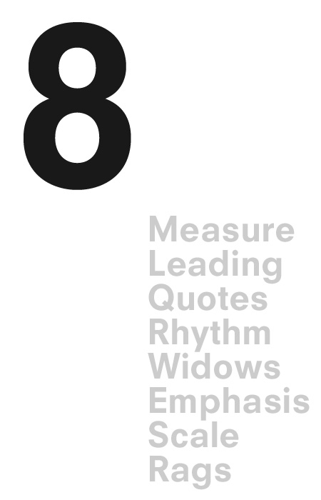
You Found Level 8 Typography Armor


This Article will be especially enjoyed by those of you OTIS folks that want to continue to improve your typographic abilities. This comes courtesy once again of Antonio Carusone. Read here.

Sketchy Future


Just saying...

Internet, This is Antonio Carusone. He is awesome.

Obviously, this above image is the background for my new iMac,
that I am currently obsessed with, courtesy of AisleOne, a new
addition to my daily blog reading. He has a great variety
of his own stellar work, awesome posts sharing modernism
as it exists in today's world. He basically is cut from the same
cloth as me as far as interests go, so needless to say I will
be checking out his site constantly. Not to mention this
beautiful thing he made. I'm really eyeing that t-shirt, I might
just need it.


Automatic Joy: Junior Boys "Count Souvenirs", Virus-"As
Virulent as You", Brand New (Blog) new layout, My killer
computer, Wet Hot American Summer, and school starting
soon kind of.


Wednesday, July 8, 2009

Look-sees


Marc Meredith, the Dean of Admissions at my
lovely institution apparently saw it fit to
feature my blog in a little writeup on his blog!
He describes this little internet space as
having "insightful commentary on design...".
Exciting ehh? Well, isn't that just a wonderful
thing! It brightens my rather dull internship
office space with just the right amount of
sunshine.

Enjoyment: French Toast Bagels, Wilco (the album),
Staying busy, lots of Tennis, Junior Boys, the prospect
of owning an actual Josef Muller Brockmann lithograph,
and the Stone Roses song "Don't Stop" which oddly
sounds like Animal Collective plus song writing
minus annoying.

Wednesday, July 1, 2009

Modernism to a Tea.


Well this is just gorgeous. To bad it doesn't really fit
the Nestea brand. I just want a set of these.
Can I has it?


Goings On: Junior Boys-"begone dull care", Darkest Hour-
"The Eternal Return", Dirty Projectors-"Bitte Orca",
photoshopping airplanes, Asian Food, Not going to see
Transformers ever, Getting an iMac in a few weeks, and
hopefully playing tennis soon.


Monday, June 8, 2009

Federererererererererer.....!


I am very specific about what gets me excited. I am extremely
picky and find myself not liking a lot of things; instead having
a very specific pool of items that I am passionate about. Recently
it seems, over the past year or so the sport of Tennis has become
one of those things.

This past week saw the anointing of Mr. Roger Federer as the
'09 French Open champion. A feat hewas unable to complete
for on 4 separate attempts. I watched nearly all of the matches
he was in and found myself in awe of the 27 year old's grace
and masterful playing. I have never been one for fanfare,
and it seems Federer and I share that. His style is subtle and
commanding, but almost understated. Watching him play
is akin to listening to complicated and densemusic, as both
appear standard or unassuming at surface level,
but after a prolonged and focused exposure one experiences
how truly magnificent either can be.

That all said, Take a closer look at this lovely little sport, one
free from macho posturing and beer endorsement, it is a
pretty sight to behold.

Oh and Congratulations to Roger Federer!

Sunday, May 31, 2009

Type Cast-Axel is a Rose


Erik Spiekermann is not one of my favorite designers.
His typefaces, although held in high regard remind
me far to much of the "personality" of the 90's, which
just makes me sad. That said though, I might be a fan
of this new one he created for the ever-exciting
world of excel sheets. It is called Axel. It was created
with regard to the condensed columns and boxes
of the excel program and quite honestly, it looks great
serving that rather mundane purpose. I'm quite
partial to the lowercase "l", the little lip of the "y"
and the slanted tops of the ascenders a la "interstate"
and other road sign typefaces. All in all,
Spiekermann's usually overtly quirky tendencies
work out here for me.


Mhmmmm: Grizzly Bear-"Veckatimest", Ameseours, Being Broke,
Going home for a spell and Kayo Dot on the 9th.

Saturday, May 30, 2009

Explanation


This poster and quote, although a little intense,
especially regarding the large text, really makes
me happy. It basically explains how I see and
approach design.

"I didn't get into design
to be an artist. To me, an
Artist creates things to
evoke emotion. Being a
designer goes a step
further than that, not only
trying to evoke emotion
but trying to make a
reaction. It is very
objective-driven, and that's
what makes it interesting."


Also, a very lovely looking poster.


Round and Round: St. Vincent-"Actor", Phoenix-
"Wolfgang Amadeus Phoenix", Grizzly Bear-
"Veckatimest", Summer, Cherry Dr. Pepper, and
French Bread.

Tuesday, May 12, 2009

Wowie Zowie


So as most of you OTISians have done already,
we were assigned to make a Typographic booklet
based on a mental/physical illness. I decided to
do claustrophobia. I am still in the midst of
completing mine, but above is an example Erin,
my teacher sent of a neat gatefold book on
the Balla-Dora Typographika blog. She sent
it because there is a theme of covering and folding
in my structure that I have been trying to resolve.
Needless to say the example is stellar, and inspiration
has found a home in my mind once again.

Excitment surrounds: Opeth/Enslaved show this weekend,
, Writing Music for real this time(1 song nearly done for
my black metal/shoegaze like project!)
Overall relief abounds.

Monday, May 11, 2009

Aminals...Animals...


Above are two incredible pieces, entitled "Fight/Flight"
by miss Jessica Cooper, that I can't take my eyes
off of. Her work is stellar in general, focusing on
lesser known and intriguing nature facts and such.
I highly recommend checking her stuff out
along with all of her lovely and talented friends in the
senior illustration class that just graduated.


Into: St. Vincent, Ameseours-S/T, Peach candy,
melon soft drinks, expensive toothpaste.

Saturday, May 9, 2009

Pargas with a P; Poster with an Awesome


Above is one of the most killer things I have
seen as a product of an OTIS student. This type
design and poster was designed by Mike Pargas,
one of the most solid individuals I have met
during my time at OTIS.

There is a lot we could talk about here, tons of nuance
in this little display face. The curved top of the "C",
the entire letter "x", the tension of the "s", and the
slits in the "v" and "w" are all really unique ideas that
breath a refreshing life into the font.

This guy here has been a major inspiration as a designer
and a human being. Keep an eye on him and his work
as he is now a graduated OTIS alumni. Good luck to
you friend.


Cheers: St. Vincent "Actor", not getting beaten up in a fight
last night, Funeral Mist-"Marantha", ISIS-"Wavering Radient"
Summer, Getting it together and Fuji apple pear lifewater.