Sunday, July 26, 2009

Im 21 years old therefore I like French new wave cinema.


The above being stated, I had the pleasure of seeing this film in theaters for the first time along with a couple other lucky folks, as it was never released in the US until recently. The movie itself is Godard at his most obscure and deconstructed, at least I think so. Names and conversations disappear under the din seemingly arbitrarily placed sounds and silence. Anna Karina looks stunning as she did, and the cinematography is simply perfect, awash in red, white and blue almost comically.

Also, I really enjoy the packaging, designed by John Hardy. It is a simply approach but one that really captures the feeling and focus of this bizarre film. The use of the staggered image, as simple a device as it is, perfectly encapsulates the feeling you experience while watching this film. There is one scene specifically where Anna Karina is sitting at a table in a restaurant awaiting to be unhand-cuffed and the wallpaper behind her is askew, seemingly aligned by a blind man. This tiny architectural detail really struck me when I saw the movie originally, and I even wrote down a note about it, as I was considering using something like that in my Virginia Woolf Poster Project. So it is really neat to see that element used in the stellar packaging for this challenging film. Once again the Criterion Collection wows with it's discerning in packaging. Great work all around.

Friday, July 24, 2009

Eagle Hat 2.0


After a summer of not doing to much design,
for lack of correct software, and just exhaustion
from work...which I will show later on, I finally
managed to sit down for a few hours and make
this little guy. He is a the official logo of my
somewhat "joke" greeting card series. I drew the
original with this kind of look in mind, a la
firefox and all that web 2.0 silliness. That being
said, I see an importance in trying to create things
with that feel as, although I may not "love" the
style...It might be to someone else's liking.

The whole vectoring and painting process took
like 3 hours, so it wasn't to intense. Some of
the light logic is off...but Ill fix it soon. I also
want to implement some type to finish of the
Eagle Hat trademark.

Overall, I give this whole "jolly rancher" web 2.0
look 5 years tops...then we will be way into a new
dimension with SPACE GRAPHIC DESIGN!!!

Musix: Alela Diane, Junior Boys, Katatonia, Bat for
Lashes, and Sleepytime Gorilla Museum

Tuesday, July 21, 2009

Friendly=Recession


I just have to give a loud and resounding
"Word." to this here post via Jeff Staple. I'm
not sure where the above image is from, but
you probably love it...don't you. I think it
might be from married to the sea...but maybe
not, oh here it is as a shirt.


Spinning: Alela Diane, Crystal Castles, Darkest
Hour, Broken tennis racquet, a website soon...eh?

Yes we Pelican.


By the way, friends, this is a great example of an awesome illustration.

Help...I am in Love.


Quite simply one of the most beautiful packages I have seen all year. A wonderful, playful approach to the mundane world of remedies (Unless we are talking about the stellar swiss company Geigy). The use of color and negative space with embossed shapes is triple awesome. I feel like this perfectly embodies the austere correctness of modernism with just the right amount of playfulness to appeal to as wide an audience as possible.

I mean, does anyone just not like this? I defy you to hate this...you silly heartless chap.

The website is one of the more interesting places on the internet, and overall this is something that I just can't stop looking at. I ordered three of them, and am actually REALLY excited about holding these lovely things.

Joy Apparent: Alela Diane-"To Be Still", Metric, my ipod touch, moving, and tennis.

Monday, July 20, 2009

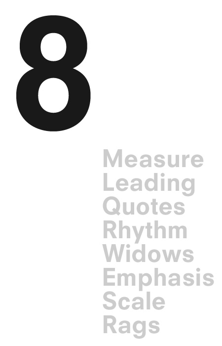
You Found Level 8 Typography Armor


This Article will be especially enjoyed by those of you OTIS folks that want to continue to improve your typographic abilities. This comes courtesy once again of Antonio Carusone. Read here.

Sketchy Future


Just saying...

Internet, This is Antonio Carusone. He is awesome.

Obviously, this above image is the background for my new iMac,
that I am currently obsessed with, courtesy of AisleOne, a new
addition to my daily blog reading. He has a great variety
of his own stellar work, awesome posts sharing modernism
as it exists in today's world. He basically is cut from the same
cloth as me as far as interests go, so needless to say I will
be checking out his site constantly. Not to mention this
beautiful thing he made. I'm really eyeing that t-shirt, I might
just need it.


Automatic Joy: Junior Boys "Count Souvenirs", Virus-"As
Virulent as You", Brand New (Blog) new layout, My killer
computer, Wet Hot American Summer, and school starting
soon kind of.


Wednesday, July 8, 2009

Look-sees


Marc Meredith, the Dean of Admissions at my
lovely institution apparently saw it fit to
feature my blog in a little writeup on his blog!
He describes this little internet space as
having "insightful commentary on design...".
Exciting ehh? Well, isn't that just a wonderful
thing! It brightens my rather dull internship
office space with just the right amount of
sunshine.

Enjoyment: French Toast Bagels, Wilco (the album),
Staying busy, lots of Tennis, Junior Boys, the prospect
of owning an actual Josef Muller Brockmann lithograph,
and the Stone Roses song "Don't Stop" which oddly
sounds like Animal Collective plus song writing
minus annoying.

Wednesday, July 1, 2009

Modernism to a Tea.


Well this is just gorgeous. To bad it doesn't really fit
the Nestea brand. I just want a set of these.
Can I has it?


Goings On: Junior Boys-"begone dull care", Darkest Hour-
"The Eternal Return", Dirty Projectors-"Bitte Orca",
photoshopping airplanes, Asian Food, Not going to see
Transformers ever, Getting an iMac in a few weeks, and
hopefully playing tennis soon.