

In case you do not know, I was savagely awaiting the chance
this semester to work on my modernist typography
abilities. My dad's b-day card was my own exploration, but
this above is one of three letterheads we had to design ourselves,
by hand with no assistance from a computer.
We had to cut out type from a sheet and paste it into grids in order
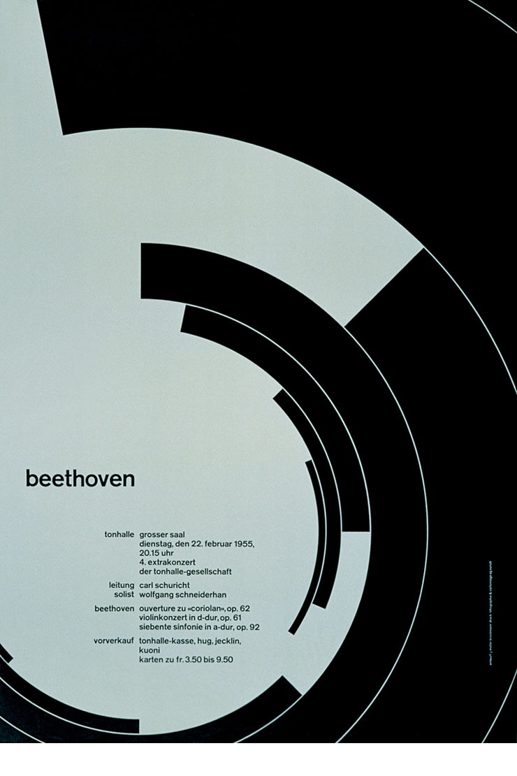
to work it out.The goal was to create a letterhead fit for the subtle
complexities of Josef Muller-Brockmann,which aside from being a
typographic badass, is my favorite designer OUT THERE. Look at this
...see, the guy was a geometric master, perfectly fusing type and form,
aligning in ways only numbers could.
So the above is my attempt to capture his essence in a letterhead. It
took me 3 hours in the early morning, with the help of a few winter
ale's, and lots of close looking and detail hunting.
Deceptively complex indeed.
-P
No comments:
Post a Comment