Friday, February 27, 2009

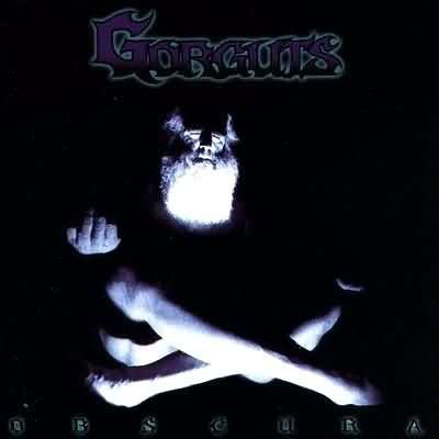
Recommendation: Gorguts-"Obscura"


This is no post about design...let me tell you. It is simply
a statement. It goes as so:

This record will change you're whole perspective on music.
it is out of print, but you can download it on the internet
at this place. "Obscura" is literally one of the weirdest
records out there, so go check it out.

that is all.

Bodoni Old Style; Word.


Another entry to the Flickr series. By now you should
know i don't really pick at random, but instead try
and find things that would make sense as a full package.
This one is mainly nice because of the sweet photo.

-P

On it: Darkest Hour-Deliver Us, Band shirts, Darkest Hour-
"Full Imperial Collapse" (That ending is CRUSHING!),
Pictures of Owls, The Breeders-Night of Joy,
Reading a book soon.

Thursday, February 26, 2009

Pigs is Pigs.


So I think I might be doing a series of random cover
designs, just to practice doing what I do. I'm doing
that Flickr thing being thrown around the internetz,
so yeah, that's all, here is one...nothing intense, just
working with type and image.


Currently Digesting: Asobi Seksu-Hush, Darkest
Hour-Deliver Us, Junior Boys-Begone Dull Care,
Virginia Woolf Poster on the brain, Awaiting
new Isis record, Akzidens Grotesk, and Sean
Mccabe'salways good design work.

Wednesday, February 25, 2009

Virginia Woolf was totally a sans-serif type of woman...


This Virginia Woolf poster is getting intense as we
go along, I mean it has always been a psycho
project, but as we come to the final weeks refinement
is key. Above is the new/old direction I think will be
the final poster. The previous examples i posted
here have seemed to reach the point that they
will not work for this project in the fashion that
i want them too...so i am revisiting one of the
original images I had...a xeroxed house.

Now, what you see here is just a rough attempt
I played with while waiting for my Advert. class
so it's just a sketch if you will. The same idea is present
from the candle posters, with the flowers blooming
from an extinguished entity, therefore symbolizing the
passage of time, and the lingering beauty and all that
Virginia Woolf stuff.

To be honest, I am more excited to work with this palette
of elements , as the modernist typography is more my forte
and the washed out image just looks awesome. In the coming
weeks I will refine this image until it looks as awesome
as the work of this place....well at least an attempt.

So in short, again...I am re-excited about this Poster and finally
getting to keep at my modernist typography abilities, because
I do love it so.

-P
Tuesday, February 24, 2009


So here we have 2 of 3 drawings we had to do
for drawing and painting class. Koloman
Moser was the inspiration again. The blue i have
going on here is probably darker than it
should be, butthat is most likely due to impatience.

I'll post the rest as they become available.

Sunday, February 22, 2009

Greens, Greens and Greens.


Above we have another step closer to
that Virginia Woolf poster i have been
working at for a while now. I'm pretty happy
with the colors, and I think the candle is good
also. I can't get 100% behind the smoke just
yet, but i do think it's an improvement from the
last one, that i can't even look at anymore.

This is in no way a final, as the type and borders
aren't what i wanted exactly, but I'm feeling it close
in on something that might be a nice little poster.

Click picture for large version.

-Paul

(P.S. ill fix the spelling errors later...blah blah.)

Saturday, February 14, 2009

Give a Hoot.


Hoot-Beer.....ahahaha.
Yes i like this.

Friday, February 13, 2009

...the hell?


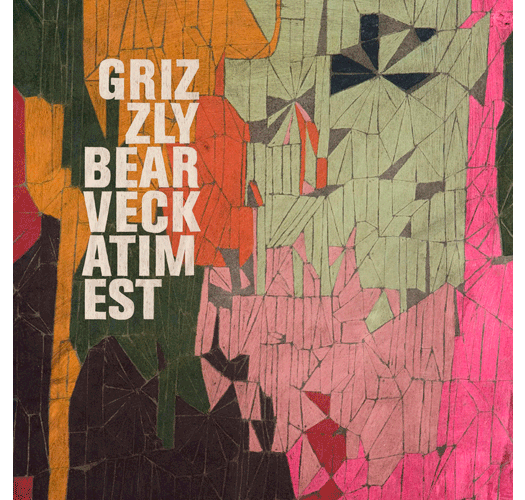
Considering Grizzly Bear is one of my favorite bands, seeing them at the
Walt Disney Concert hall is one of my favorite moments ever, and the artwork
for "Yellow House" is one of the most beautifully photographed packages I
have ever seen, my standards are pretty high for this wonderful band; So why
on earth did they just plop this all-caps condensed white type on this mildly
cool/a little pointless drawing and call it a day? The name "Veckatimest" sounds
a little mars volta to me, but pitchfork assured me as they like to do, that it is
the name of a uninhabited island near Massachusetts....which is very GB if you ask
me.

I'm not at all worried about the record as both their new songs and singer Daniel
Rossen's "Department of Eagles" record was one of my faves from last year,
but this art work is a little off putting....Although Victoria Legrand of
the Beach house (another fave) appears...adding to my comfort.

So all in all it should be grand....just

RESOLVE THAT TYPOGRAPHY DAMNIT!

-P

Thursday, February 12, 2009

WTF....pink?


This here is the next movement for the poster
sketch mentioned earlier.Today was a pretty
productive day,especially considering
that I got only 3 hours of sleep last night
due to type and horsing around.

I'm not totally psyched on the colors, and
the pink is especially questionable. I think
I'm going to leave the area around the candle
lighter than it is and make it pop more via
thicker outlines and such.

I must say it looks slightly better on screen
which is comforting, considering it needs to
be digitized to print.

Well...that's it for this and that, to tea and
to sleep.

p.s. "Fractured Beacons" is the title of my
fictional reading...but it won't look like that
i just wanted to see how type would be.

Don't be a letterhead.


In case you do not know, I was savagely awaiting the chance
this semester to work on my modernist typography
abilities. My dad's b-day card was my own exploration, but
this above is one of three letterheads we had to design ourselves,
by hand with no assistance from a computer.

We had to cut out type from a sheet and paste it into grids in order
to work it out.The goal was to create a letterhead fit for the subtle
complexities of Josef Muller-Brockmann,which aside from being a
typographic badass, is my favorite designer OUT THERE. Look at this
...see, the guy was a geometric master, perfectly fusing type and form,
aligning in ways only numbers could.

So the above is my attempt to capture his essence in a letterhead. It
took me 3 hours in the early morning, with the help of a few winter
ale's, and lots of close looking and detail hunting.

Deceptively complex indeed.

-P

"To the Lighthouse" Poster Project


So the above is the first sketchy exploration into
an idea i have had slowly been brewing for
a while. It is for a project that involves
making a visual metaphor for a book that we
read. I chose Virginia Woolf's "to the lighthouse".
I have been recently obsessed with Alphonse
Mucha and Kolo Moser's work, the latter which
heavily influenced this in a specific way thanks to
this poster. It's the one on the right.

It's a brand new direction for me and i am
interested in seeing it through to
awesomeness.

-P

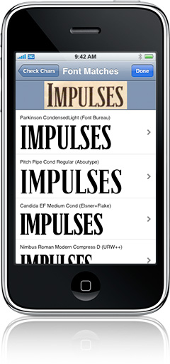
OH MY GOD!


So this device here, this iphone in the photo,
has a newly released app that can, get this...
recognize fonts thanks to the built in camera!
Do you realize how many times i have seriously
of something like this...fonts go by us day by day
and we don't know what they are! AHH!
This is huge!

Full story at Swiss Miss.

Airplanes and Type as Breasts


Well look at this little change! I have never been on this airline,
but i am a fan of french things like Audrey Tautou, Godard,
and snootiness. It seems that i have another thing to like about
this intriguing people...solid logo design with some kickass type
to boot!

Not to mention this one too...


Although i like the AirFrance logo more than this one, it's cool to
see a country explore new graphic situations. The type on the
above logo is a little iffy, but i am extremely picky about hand-drawn
type. Also, for those of you that like some boobs in your logos...check
out the early iteration of the "Rendez vous en France" mark.


Nice one.

All thanks for the images goes to this lovely place.

Monday, February 9, 2009

Three hour three piece puzzle.


So this, this here i spent nearly 3 hours on.
Yeah...what? It's for my theory in practice class;
we were told to make one item supporting a
Platonic world view and one promoting an
Aristotelian world view.

It is hard to tell but there was very careful
planning involved in making this poster/book cover.
The white space was very considered and in
proportion of one another inside the black bars
to the title and along the right wall with the base
being that upper bar.

It's mainly wankery with typography, but i am
convinced that I will be be a solid typographer
by years end, or i will be damned.

So in short, this is an exercise in objective use
of form and type represented by simply that
and geometry.

Oh and if anyone has read Plato's cave analogy
...this is designed around that concept....get it?

Just remember that the sky is blue.

Sunday, February 8, 2009

BirthQuake Cards


So February is a big month, Black history month,
Tiimo's and my Dad's birth, Valentines, and also
my 21 will pass on the 23rd. I got into indesign
and came up with this little guy that i think i'm going
to use as a template for giving out to people on their
assorted special days. It has a few things, after you
printit out that need fixing, but hopefully after a
few attempts i will have a beautiful typographic
sensation a la anything these guys do.

For anyone that cares, the Tiimo version of this
card was like so:

T
is for Tiimo.
is for Trick Ass Hoes
is for Twenty One is a
year away Heezy.

and that was that.