Thursday, February 12, 2009

OH MY GOD!


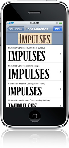
So this device here, this iphone in the photo,
has a newly released app that can, get this...
recognize fonts thanks to the built in camera!
Do you realize how many times i have seriously
of something like this...fonts go by us day by day
and we don't know what they are! AHH!
This is huge!

Full story at Swiss Miss.

Airplanes and Type as Breasts


Well look at this little change! I have never been on this airline,
but i am a fan of french things like Audrey Tautou, Godard,
and snootiness. It seems that i have another thing to like about
this intriguing people...solid logo design with some kickass type
to boot!

Not to mention this one too...


Although i like the AirFrance logo more than this one, it's cool to
see a country explore new graphic situations. The type on the
above logo is a little iffy, but i am extremely picky about hand-drawn
type. Also, for those of you that like some boobs in your logos...check
out the early iteration of the "Rendez vous en France" mark.


Nice one.

All thanks for the images goes to this lovely place.

Monday, February 9, 2009

Three hour three piece puzzle.


So this, this here i spent nearly 3 hours on.
Yeah...what? It's for my theory in practice class;
we were told to make one item supporting a
Platonic world view and one promoting an
Aristotelian world view.

It is hard to tell but there was very careful
planning involved in making this poster/book cover.
The white space was very considered and in
proportion of one another inside the black bars
to the title and along the right wall with the base
being that upper bar.

It's mainly wankery with typography, but i am
convinced that I will be be a solid typographer
by years end, or i will be damned.

So in short, this is an exercise in objective use
of form and type represented by simply that
and geometry.

Oh and if anyone has read Plato's cave analogy
...this is designed around that concept....get it?

Just remember that the sky is blue.

Sunday, February 8, 2009

BirthQuake Cards


So February is a big month, Black history month,
Tiimo's and my Dad's birth, Valentines, and also
my 21 will pass on the 23rd. I got into indesign
and came up with this little guy that i think i'm going
to use as a template for giving out to people on their
assorted special days. It has a few things, after you
printit out that need fixing, but hopefully after a
few attempts i will have a beautiful typographic
sensation a la anything these guys do.

For anyone that cares, the Tiimo version of this
card was like so:

T
is for Tiimo.
is for Trick Ass Hoes
is for Twenty One is a
year away Heezy.

and that was that.

Monday, January 12, 2009

Anti-Cipaton?


No I did not take that picture....
but yes it is drilling a hole in space.


In other words...i can't sleep
and i have class in a few hours
....what is the deal man.

Friday, January 9, 2009

Green Reflection


This here is simply the completion,
kinda, of the below drawing.
Again, i can't stress enough that this
is not entirely original, especially the main
figure. It is mostly drawn freely from
some of Alfonse Mucha's works,
although the background character
uses his drawings simply as models
and she in no way resembles
anything of his.

I'll most likely go back and detail
the orange hair and add some crazy
background noise.

Lastly, i titled it after an Enslaved song
(which if you care is called "Green Reflection"
and is on the "ISA" record...which is awesome).

Well I think that's that, and ill be sure to
update this post as i tweak it...for those
that just CANNOT wait.

Peace to all and to all a decent night with
no late night bathroom visits....you know,
you really should not drink all of that White
Cran-Grapefruit juice before bed.

Thursday, January 8, 2009

Part II of the Below Post


I don't know what it is, but this evening
of the 7th/morning of the 8th has been a
pretty productive period. Again, this is mainly
a rip-off of Muncha, but this time i took far
more liberties as you may have assumed by the
witch-esque lady in the background. The original
"model" is a curly haired waif...but i just went
with this Good/Evil thing.

It is not complete, as the foreground is nearly
barren minus two very decently proportioned
breasts which kind of just happened that way.
I'll keep it tasteful don't worry.

That said, It has been kind of neat exploring this
whole thing, because i never saw myself as
even liking drawing, but every now and then
it can be nice.

Let me know what you think and have just
the best day ever.

Wednesday, January 7, 2009

Le Nouveau Hôtesse De l'air


So when i went to the Arclight theater
recently with my friend Michelle and saw
the ho-hum "Doubt" i checked out the
gift shop as i always do. When i did this,
I came across a rather bizarre book of
photos of Flight Attendants, exclusively.

First reaction: What the hell.
Second: What the hell...awesome.

I asked the clerk how much it was, and
it was an unaffordable 40 bucks, so i thought
that i would check out it's price on the old
amazon.com, which i still had a outstanding
gift cert. for 20 bucks after i purchased a gaggle
of stellar Swiss design books. It turned out
to be a more affordable 25 bucks so i dished
out the extra 5 (from where i wonder?)
and i recieved it promptly, in 3 days.

It is one of the silliest, and somehow most
compelling photo books i have ever seen.
It sparked a rekindled interest in art related
whatevers, after school dissected
all of it out of me at least temporarily.
I then began thinking of how retarded/awesome
it would be to take these stewardesses
and turn them into some kind of Art Nouveau
contraption a la Alfonse Mucha.

So this silly water color/graphite/shitty paper
composition is my first free hand attempt at mimicking
that style to evetually get to a point where i can
create my own style therein. The image above is
directly sketched, free hand, from Mucha's "Job"
from 1896.

Get it?

Tuesday, December 9, 2008

A Hoot; This is it.

So, Comm studio has come to a close and i remained in one piece. It took many an argument with Agnes, my wonderful instructor whom kept telling me to CROP CROP and CROP again. So after trying with all my might to make adorable little idiot owl circles with "Z's" over their head, I succumbed to Agnes' instructions and to be honest, i think it worked quite well. The poster you see above is basically a super crop of a early iteration involving a tiny owl on a snow laden branch. People seemed to have liked it in the class, and it was chosen as an example for successful use of scale, which was affirming.

This poster here was a result of struggling non-stop with trying to create an image related to the Griffith Observatory. I fooled around with emulating structural elements of the building itself, and sticking almost exclusively to the green and white pallet of the GO but all i seemed to come up with is the most boring shit ever. So fast forward to the weekend before, 3am, post thanksgiving...I was here at the OTIS labs trying to work it out and then out of no where i remember the album cover for The Academy is.. "Almost Here" album and thought that it would be a smooth move for this poster. I chose a color pallet related to a pretty evening and then we get this poster here. I personally prefer this one, although the painted stars are silly.

Well, that is that!

I do


The above fellow is my first attempt at creating a "Type Sample Poster", a poster whose main purpose is to showcase a typeface in an interesting way, hopefully successfully taking advantage of the typeface's strengths.

I really enjoyed this project, almost to the point of neglecting other assignments by revising this poster nearly 20 times. I put in at least 20 hours overall into getting this poster to where it's at, which saying out loud on the internet makes it seem all the more ridiculous, but oh well, I enjoy Type more than i ever would have dreamed and this is hopefully a fitting tribute to one the most widely used fonts in the world.

Oh and by the way, I truly do love helvetica....the choice in headline is simply to get you to hopefully take a closer peek.

This poster is dedicated to Deathspell Omega...whom i am currently listening to for the millionth time today.

-P